VAIO:-
Although Sony has sold off its famous PC and laptop brand “VAIO” but the brand is still much popular and alive, you can purchase some amazing high tech Vaio laptop through Microsoft Online store. Vaio has very unique logo design and it was designed well to convey the message of the brand. As it can be seen in the above picture, the letters V and A in the logo are design in the shape of analog signals, and the letters I and O represents the digit one and zero, which represent binary codes. Putting these concepts together, Vaio perfectly send the message of integration of analog and digital.
FedEx:-
When we list the most famous logs, the list cannot be completed without including the famous logo of FedEx. Logo of FedEx represent the very refined message for the business. When you look closer between the white space between the Letter E and X, you will observe an arrow inside. It is not the coincident, the designer Lindon Leader has perfectly created the new typeface, which in the shape of arrow indicate the precision, accuracy and speed. When it’s come to utilize a negative space in the logo design, it is a hard job for a logo designer to implement clever ideas to counter that space. FedEx logo designed by Leader is considered among the best logos ever designed, and won several awards, it is also ranked among the 8 best logos for last 35 years by rolling stone.
Adidas:-
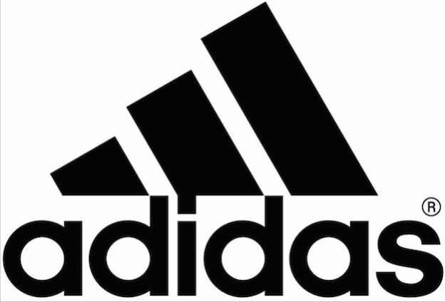
When we talk about logo designs, adidas is found to be very interesting company, as it had not one, but two different logos. The recent logo which was launched in 90s, features the three bars with varying heights blend to the left. This design was symbolize the obstacles to overcome. The later subtext carried by adidas athletic products, which help athletes to push the challenges back, and perform at their utmost potential.
Beats:-
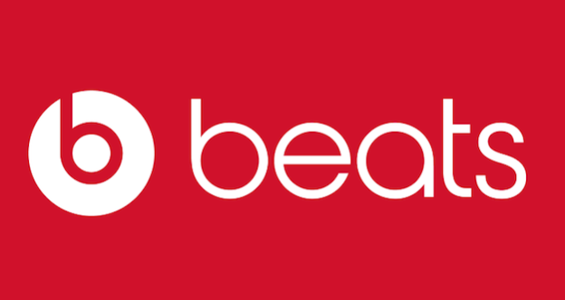
The logo of beats is not much predominant nowadays as the Beats music has swallowed by the Apple music, but people still spot the on Apple’s lineup of Beats’ headphones. At first look, the logo design seems to be simple not more than letter ‘b’ within white circle. But when we adjust the perspective, we notice that the letter ‘b’ also seems as a pair of headphones on the side face of person.